Case study · Cirkul
Lifting first-time conversion by 19%.
Cirkul makes water fun — a hydration system with flavor cartridges that lets people customize every sip. The product is genuinely different, but translating that into an e-commerce flow that explained the model and converted first-time buyers was an open question.
CtrlAltGo ran a UX audit, led a design sprint, built foundational design tokens in Figma and Tailwind, rebuilt the checkout flow around a clearer mental model, and modularized the home page so the team could ship variants without a designer in the loop.
01 · Design system
A foundation the team could build from.
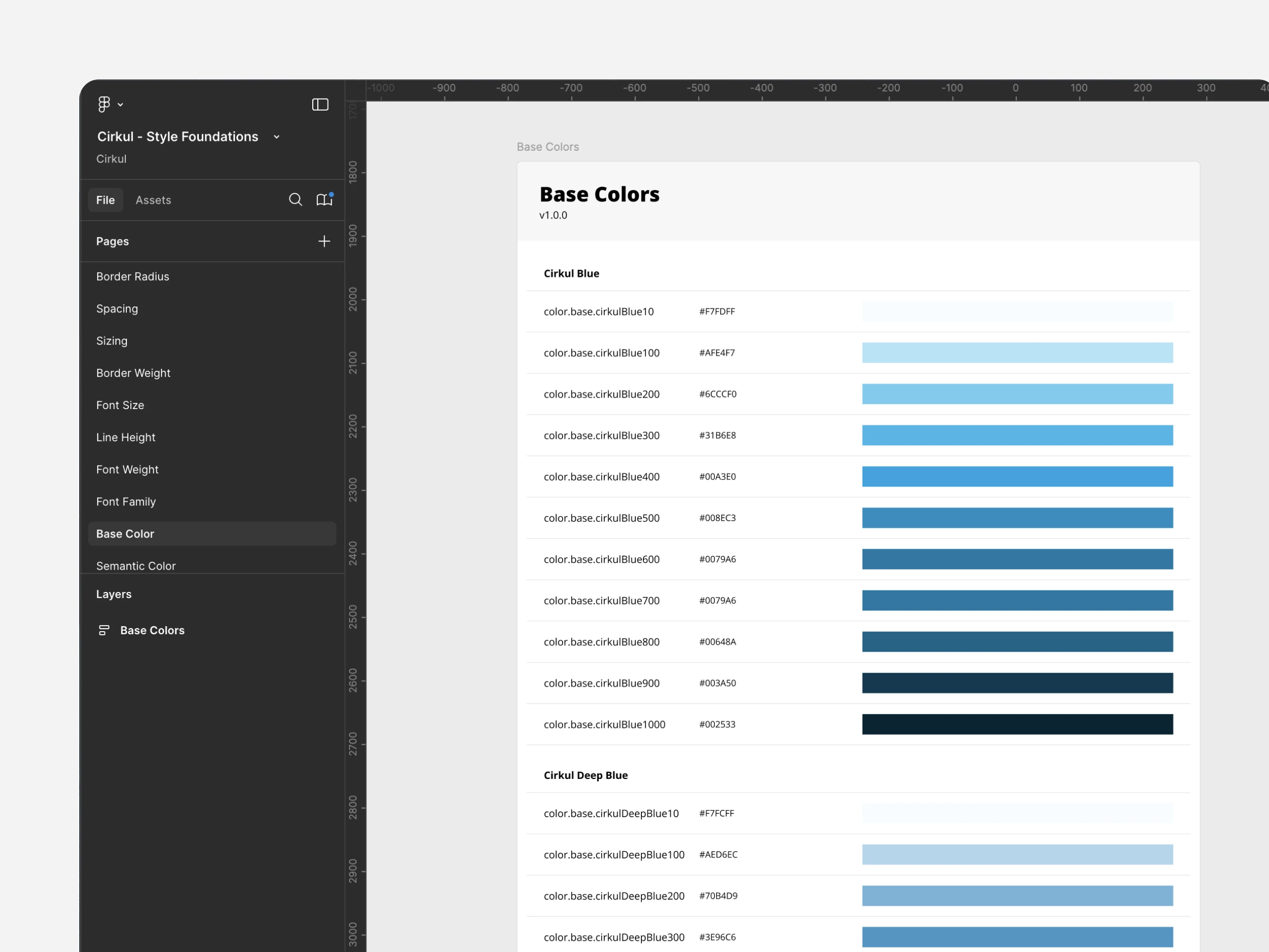
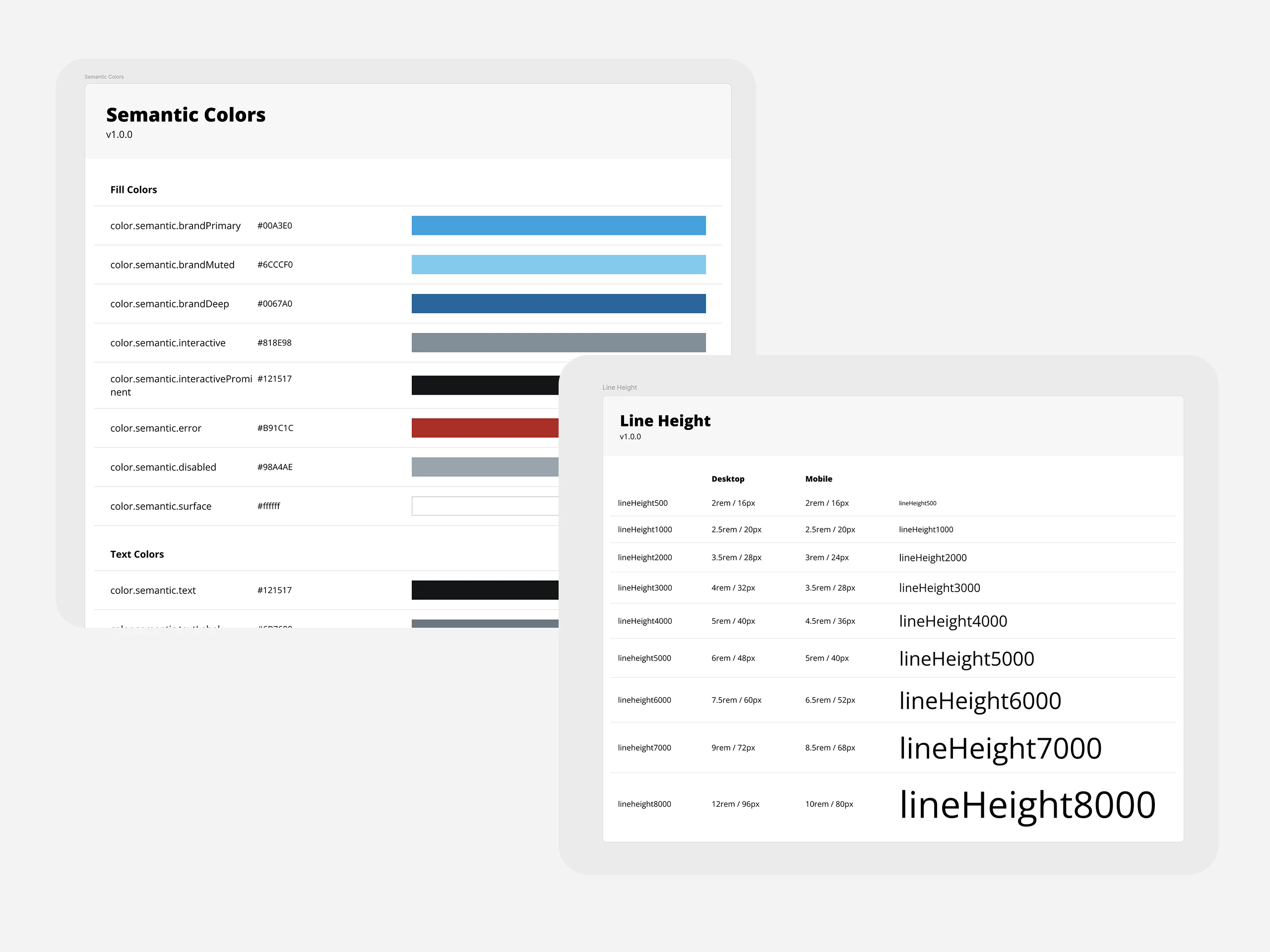
We built foundations in Figma — color, type, spacing, line-height — that Cirkul’s engineering team consumed directly in Tailwind. Tokens were named semantically, versioned, and documented inside the file so the system stayed legible to designers and engineers at the same time.
The result was a shared vocabulary that scaled from a single mobile screen to the full marketing site — and a foundation the team continues to extend without us.
02 · Checkout & components
One mental model: bottle plus cartridge.
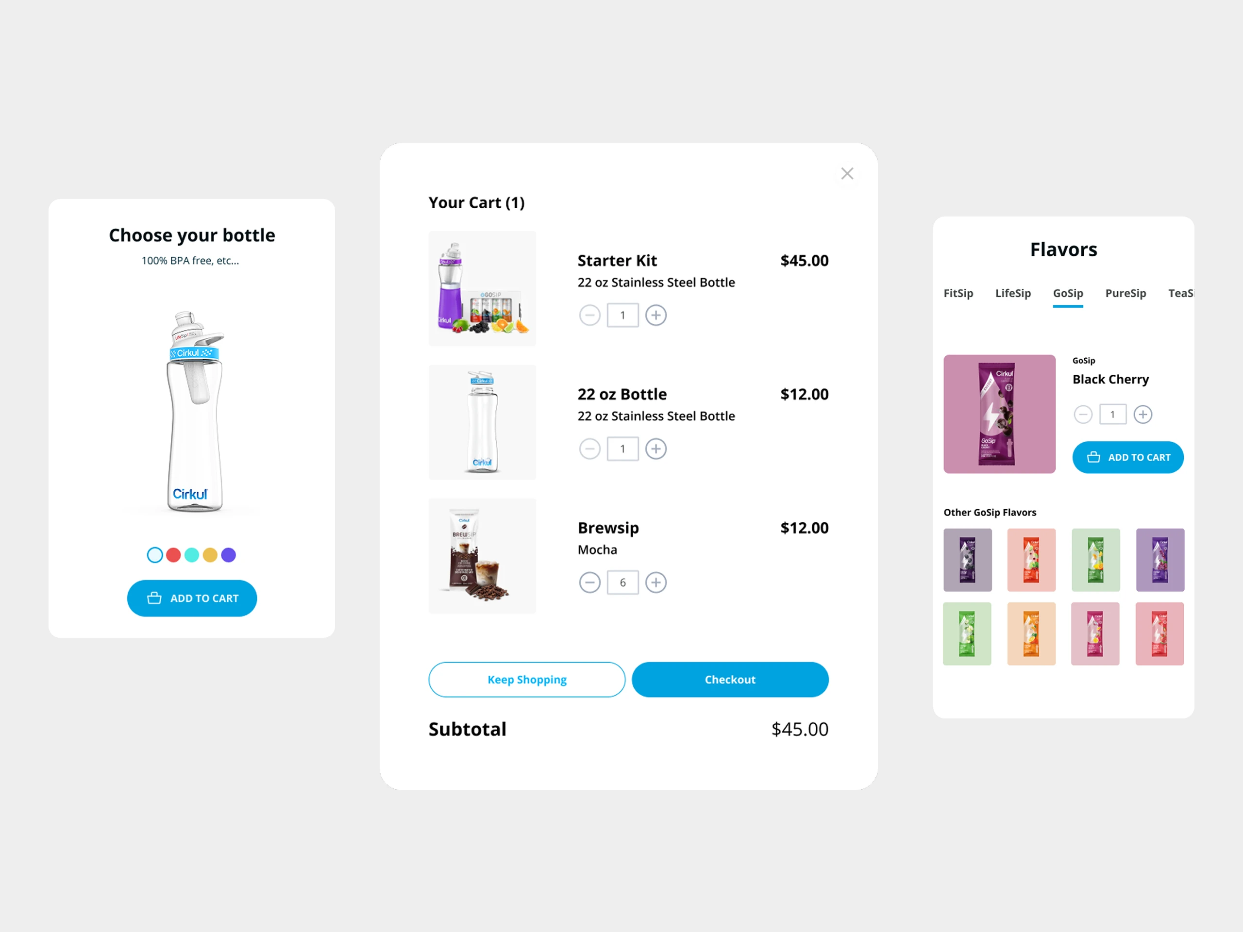
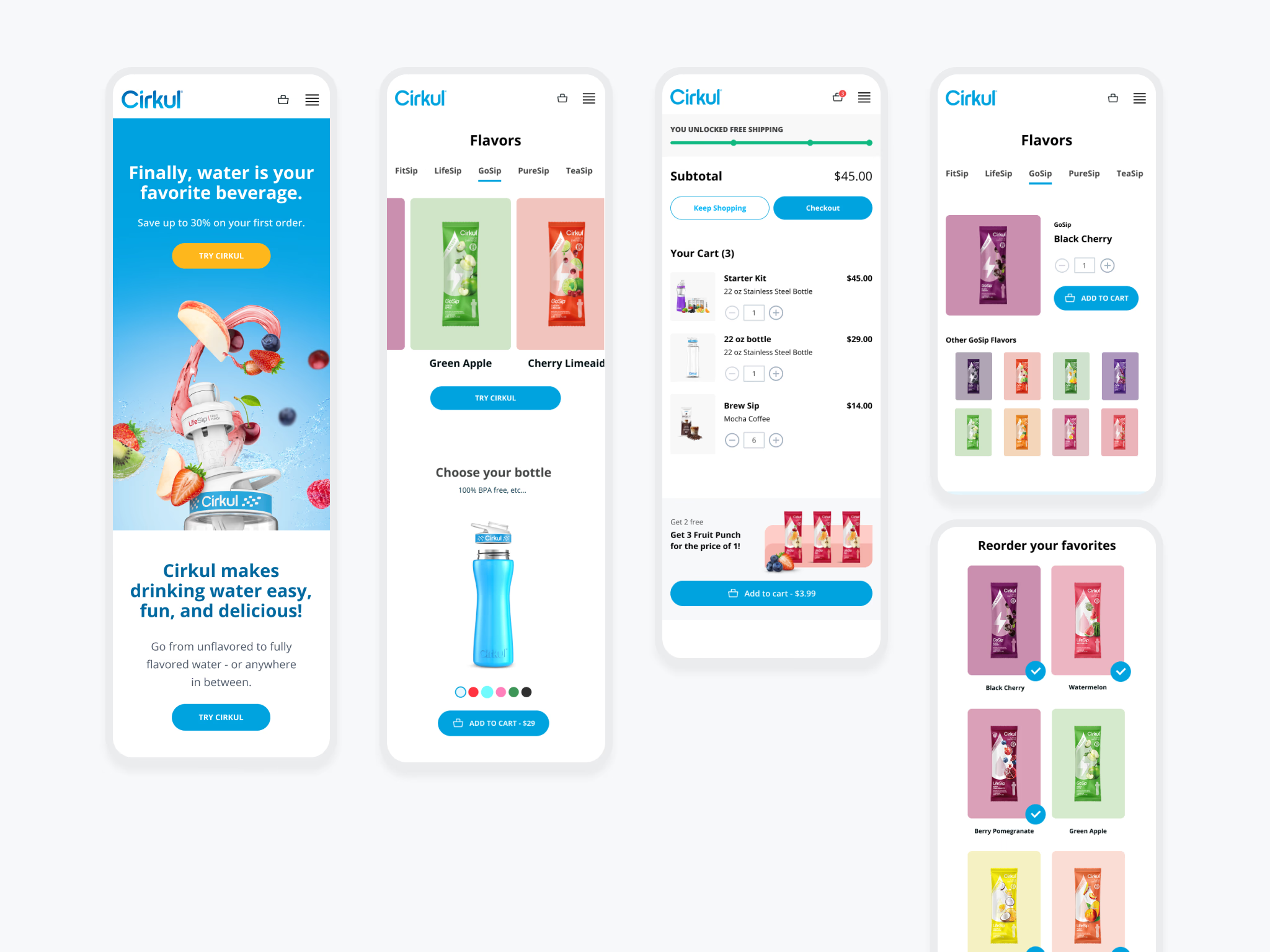
Cirkul’s purchase isn’t a single SKU — it’s a hardware decision (which bottle) plus a flavor decision (which cartridges, how many). The old checkout asked customers to hold both in their head at once. We split the flow into two clear moves and rebuilt the cart, the bottle picker, and the flavor selector as components that shared the same spacing grid and interaction patterns.
Every component drew from the same token system, so spacing and alignment stayed consistent across screens and across the engineering team’s extensions.
03 · Home page variations and testing
Modularized so the team could ship variants without a designer in the loop.
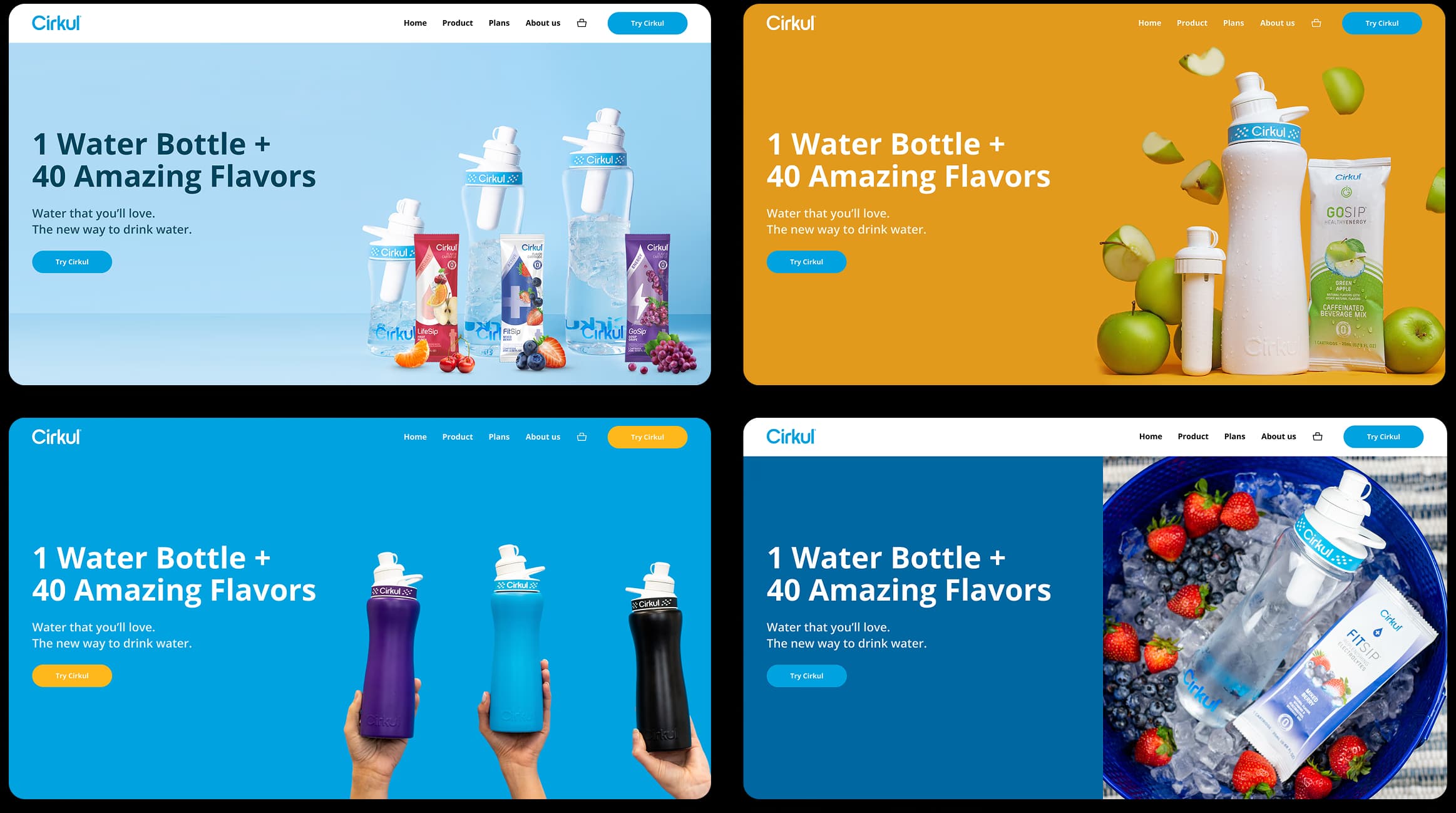
We built the home page as composable modules — hero, feature blocks, flavor strip, social proof, footer — each one swappable. Different palettes, different lead photography, different headlines, all from the same toolkit. Cirkul’s team ran themed and copy-driven A/B tests on their own cadence without booking design time.
Mobile got the same treatment: a coherent flow from the first scroll through choosing a bottle, picking flavors, and reordering favorites — all expressed in the same component vocabulary.
Outcomes
What it added up to.
+19%
First-time customer conversion.
+42%
Email subscriber growth.
1.0
A versioned design system the team continues to scale from.
Collaborators
Cam Cress (research and design), Robert Navaille (design system), Kevin Taylor (art direction).